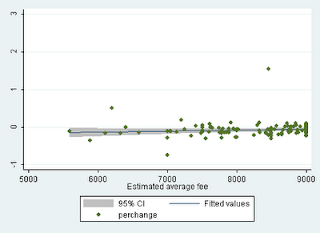
Here is my first take on the UCAS figures released today for the 2012 round of university applications. I've done some quick and dirty work on the numbers supplied by the Guardian. This is nothing more than a first pass, it takes the data at face value and it says nothing whatsoever about whether increased fees have differentially put off different types of potential applicants. It also does nothing to control for the size of the 18 year old birth cohort - which is obviously important. If we look at applications to all universities, on the basis of the Guardian figures alone, it looks like the average change in the 2012 figures compared to the 2010 base is -0.72% ie a decline of less than 1%. It's important to use the 2010 base because in 2011 students obviously anticipated fee rises and were less likely to take a 'gap year'. Using the Guardian data we can also see if the magnitude of the percentage change across universities is related to average fee levels. Data on the latter are missing for quite a few cases so all the usual cautions apply. However, on the basis of what data there are, it looks like the answer, at the institutional level, is no and this is true whether or not you adjust for bursary provision and fee waivers. Here is a very rough and ready graph of the relationship. The regression slope is essentially flat and the slope coefficient is non significant (but actually positive!).
I've broken all the rules about making nice graphs, but I'm pushed for time at the moment. It will be interesting to see if a rather different story emerges when somebody is able to look at these data more carefully.


